
It is an online shopper's first interactions that can create a loyal member or a one-and-done buyer. The strategy is to make users want to create an account, increasing retention and lifetime conversion. So I have re-designed the buyer registration touch-point to get the user to their purchase first.
The New First-Time Buyer Experience
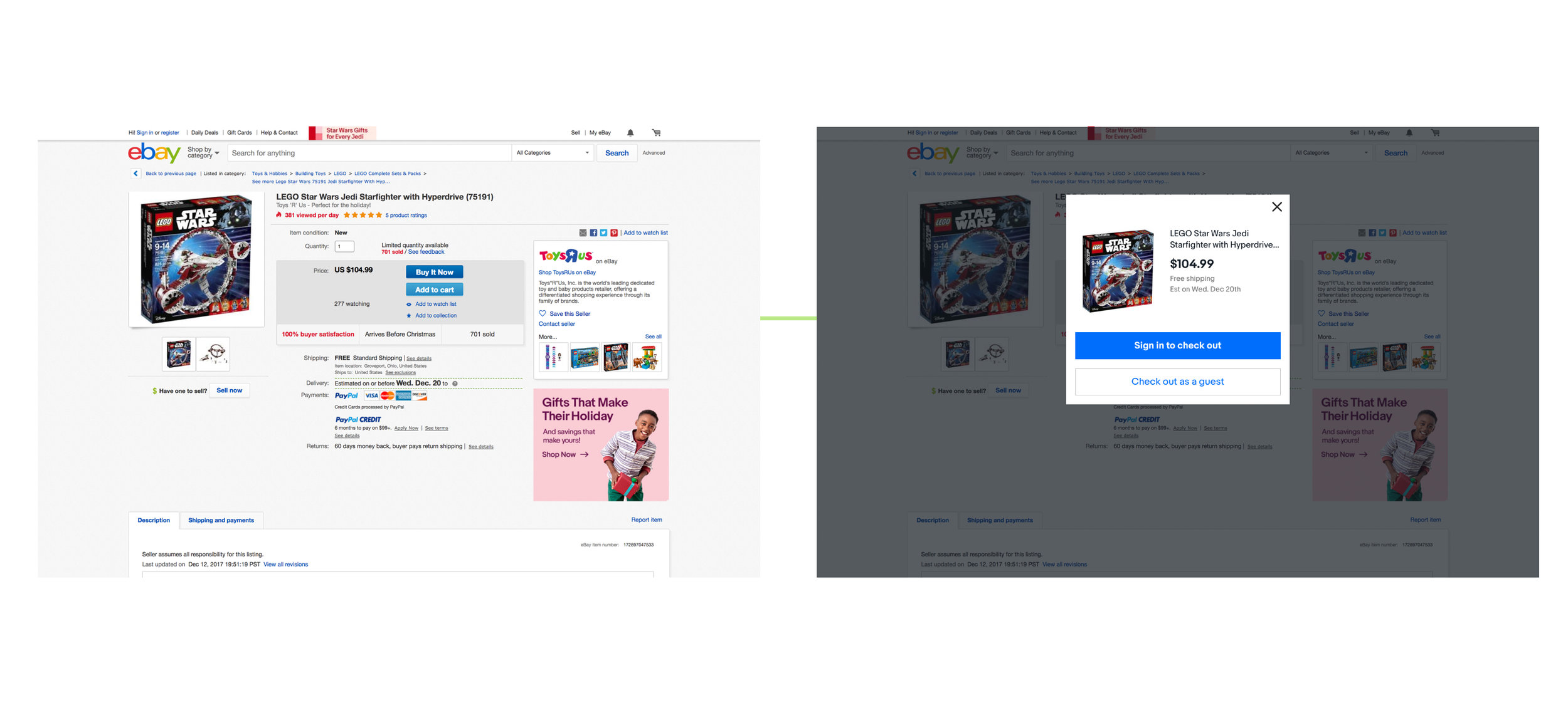
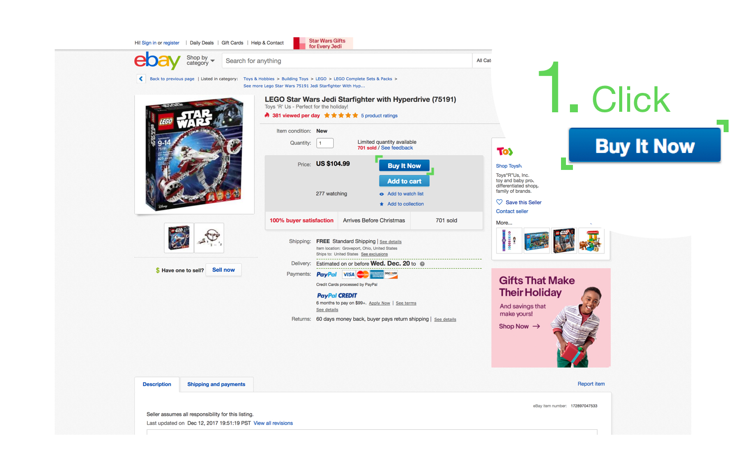
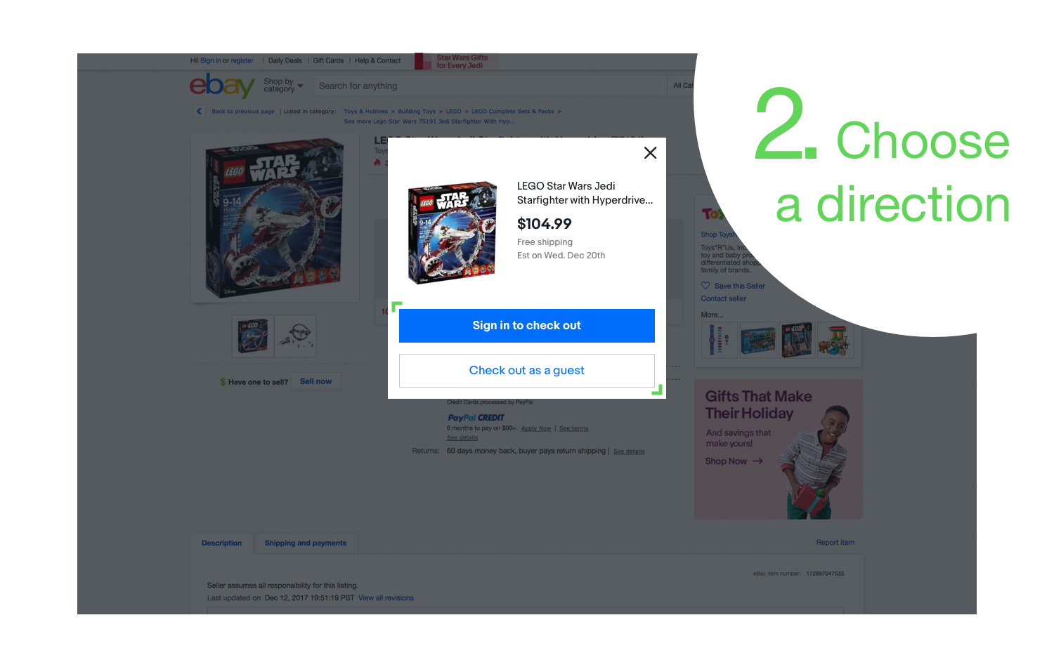
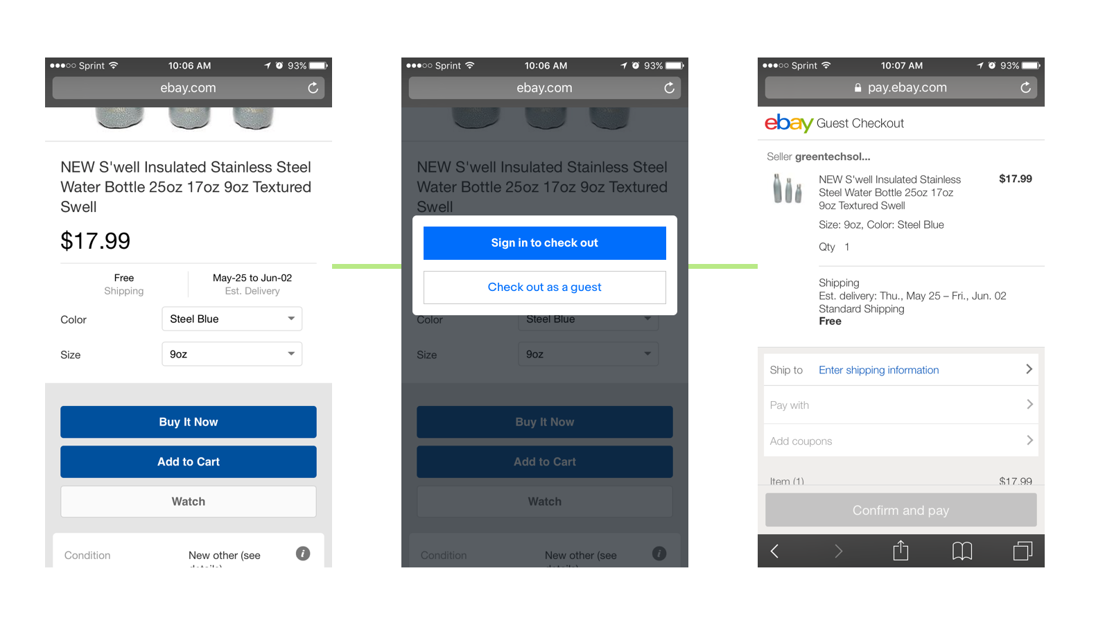
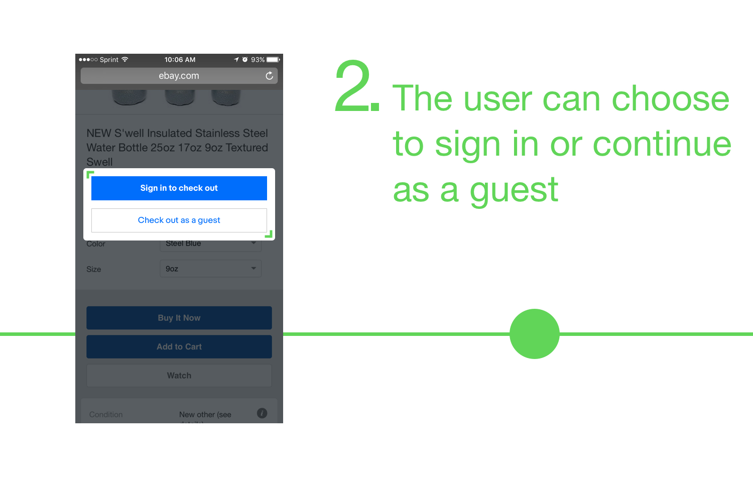
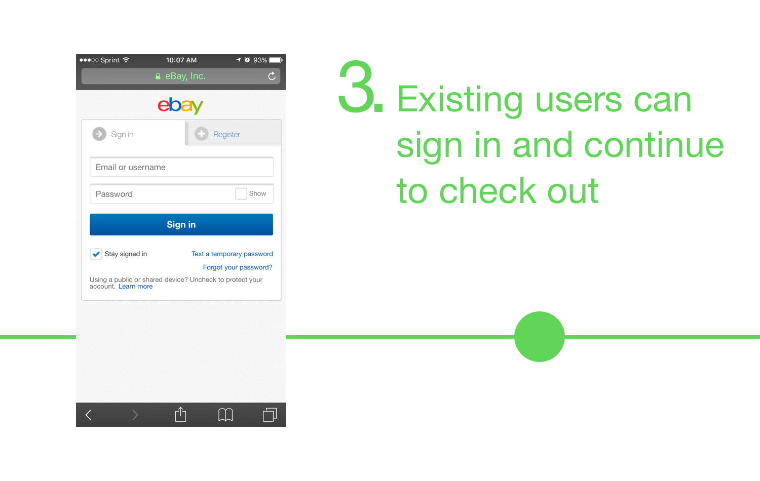
An unregistered or un-signed in user selects Buy It Now and the user is given a directional modal, getting new users to their purchase faster and existing users signing in to personalize and ease their purchase.

Desktop Directional Modal

Mobile Web Directional Modal
The Problem
First-time users come onto eBay, find the right item, tap the Buy It Now button and land on the sign in page, with options to register or continue as a guest. They are not 'Buying It Now' and they may not know how to proceed. Most new users prefer the guest route, and the layout confused even existing users.
Hypothesis
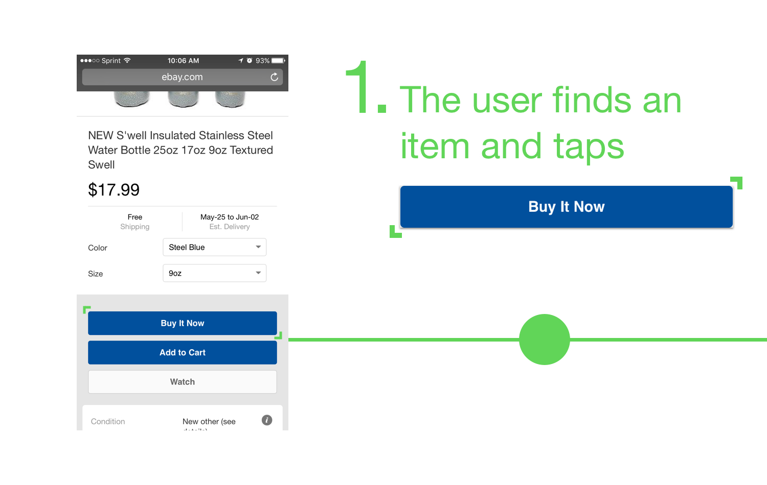
When first-time users tap Buy It Now, start the purchasing flow.
By taking users directly to purchase, eBay is creating a more delightful first touch-point in a new user's buyer journey. Then, once the user has invested in the product by making a purchase, eBay can follow up by asking the user to register, in light of how awesome and easy it was.
The whole purchasing flow, updated with the hypothetical solution.
Process
Framing
Contextualizing. Currently, no matter what path a new eBay user takes they will experience the same thing, task-wise and visually. So, we made the decision to update the registration experience one use case at a time. Making an experience more specific based on the situation's context and user's mental model can shape a more successful user journey.
Choosing a Flow. The vast majority of new users go through the full registration experience while in the midst of purchasing an item. This made it easy to narrow our focus on the purchase use case first, labeled Buy It Now.

What We Knew. Data identified two key points:
Users are dropping off throughout the end-to-end registration experience, especially on the contact info page
A large number of users, both new and existing, choose to go through the guest checkout experience
Collaborative Discovery. Through a collaborative effort, a heuristic evaluation was utilized to identify the pain points for the first-time user purchasing experience. (See Heuristic Breakdown, and Heuristic Overview)
At a high level, we identified the main problems to be inconsistency, miscommunication, and crippling functional limitation, across the entire experience, from the item page through checkout success. (See Heuristic Insights)
Constraining
Focusing the Problem. I focused my flow exploration on simplification and engagement to address the pain points identified during the heuristic evaluation, seen below.
Exploring
Explorations. Starting out with a broad range of concepts, I used a short internal feedback loop and technical considerations to narrow down to 4 flows.
1. The Entry Portal Page - the original designs, prioritizing sign in with guest checkout and registration as secondary options.
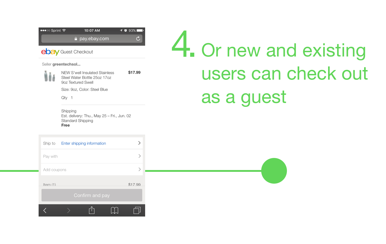
2. Guest Checkout First (GXO First) - taking users from the View Item page straight into the guest checkout experience.
3. Registration First (Reg First) - surfacing registration when the user clicks Buy It Now, as most current eBay users stay signed in for a year.
4. Social Sign Up - use social sites to minimize the registration barrier, getting the user to purchase and creating an account.
Talking to the User. Four concepts were user tested with InVision to see what users expected, what they thought did and did not work. (See InVision prototype)
Insights from the study -
The expectation is to go straight to payments when a user clicks Buy It Now, leaning towards Guest Checkout First.
The Social Sign Up and Registration First models also work for users, they just achieve different goals.
The original design was never considered by participants, qualitatively justifying our departure from its current state.
The question becomes, do we want to prioritize getting the user to purchase or have them create an account?
Focusing
Mobile First. Being that the mobile platform was the fastest growing and task driven, we moved forward with designs on the mobile web experience.

Iteration. Without being able to move forward with Social Sign Up, I iterated on the GXO First and Reg First models, adding two ideas, a directional page and an identifier first.
GXO First iteration
Reg First iteration
Directional page - using user input to direct the user to the best place for their circumstance.
Identifier First - identify the user as new or existing with their email to designate the user's path.
Stakeholders. The stakeholders decided that the goal would be to focus on the purchase, answering my question from user testing. (See Stakeholder Deck)
Having decided on the main goal, in conjunction with some behavioral data -- showing higher purchase conversion for signed in users --, 2 models remained:
GXO First
Directional page
"Data shapes the hypothesis, but doesn't prove the concepts, that's why we need qualitative data"
- Ben Mitchell, Design Director
Testing for Implementation. Two rounds of unmoderated user testing were conducted with UserTesting.com to determine which concept would be implemented in production.
In the first round,
I qualitatively tested GXO First, the Directional page, and the current flow on new ebay users, comparing user performance, expectations, and if anything stood out. (See User Testing Insights Round 1)
Results showed:
A GXO First approach met the user's mental model - users expect to enter in their payment.
GXO First met more than just a functional need - users were excited that they did not have to create an account.
Having made a purchase creates the first step in incentivizing users to register.
In the second round,
I tested GXO First and the Directional page, comparing how they work for existing users. (See User Testing Insights Round 2)
Results showed:
GXO First worked well with both new and existing users.
Both concepts worked well for existing users - the difference was in how existing users accessed sign in.
But there seemed to be more room for interpretation with the Directional page.

After reviewing the insights with relevant stakeholders, we would implement both, in order to quantitatively test their performance in production.
Defining
Production Prep. With both concepts going into production, there were some design decisions that needed to be made.
For the GXO First model, I needed to be determined the what the sign in banner would look like on the checkout page.
For the Directional page, I needed to determine what the page experience would be.
I narrowed the directional design to two concepts, a stand alone page and an overlay. Due to dependency constraints we moved forward with the stand alone page.
Post Implementation
MWeb Implementation. After both solutions were implemented, we found that while new users much preferred GXO First, more people converted into a purchase with the Directional page.
Click to see full graphic
Ramping Directional. The directional page was then ramped to 100% and proliferated to all major eBay sites. This allowed us to take on the next platform, desktop, and iterate on the directional concept.

Desktop Exploration. With a ton of data and learnings from the mobile web platform, I was able to streamline the desktop process.
Confirmation testing. I ran a competitive study between three concepts, the current experience, GXO First, a Directional Modal, on new and existing users (See Competitive Desktop User Study).
Results confirmed that the directional concept provided more clarity, making the approach more accessible to all users.
Finalizing the design. Applying the new design system and buttoning up the content, I worked with my project manager to share the concept with our stakeholders and dependencies in order to determine the final experience.
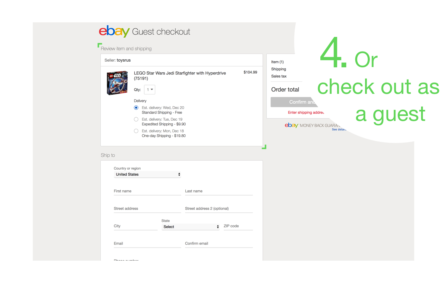
Aligning to Mweb. With desktop moving forward as a modal, I wanted to align the directional concepts across platforms by bring the advantages of a modal to the mobile platform.

Research
If you just want to take a look at the different pieces of research completed throughout this project, you can find them below.
Heuristic evaluation decks used for discovery:
The stakeholder presentation used when determining the goal of the purchase experience:
User testing insight decks used during mobile web concepting:
Competitive user tests for the desktop concepts:


Using a modal keeps the user in the context of the page they were just on, giving them greater control, which builds trust and reduces drop-off. This is further emphasizes by the desktop experience which highlights key item information on the overlay.