
Ladder is made up of three major components; the sell, the task, and the relationship. The problem is that we have spent all of our time working on how we can sell our users and how to help them complete the task, but we have let the ongoing relationship fall to the wayside. This piece focuses on why and how I updated the account experience, which leads to a more clear and scalable solution, bringing the relationship up to speed.
Design Space
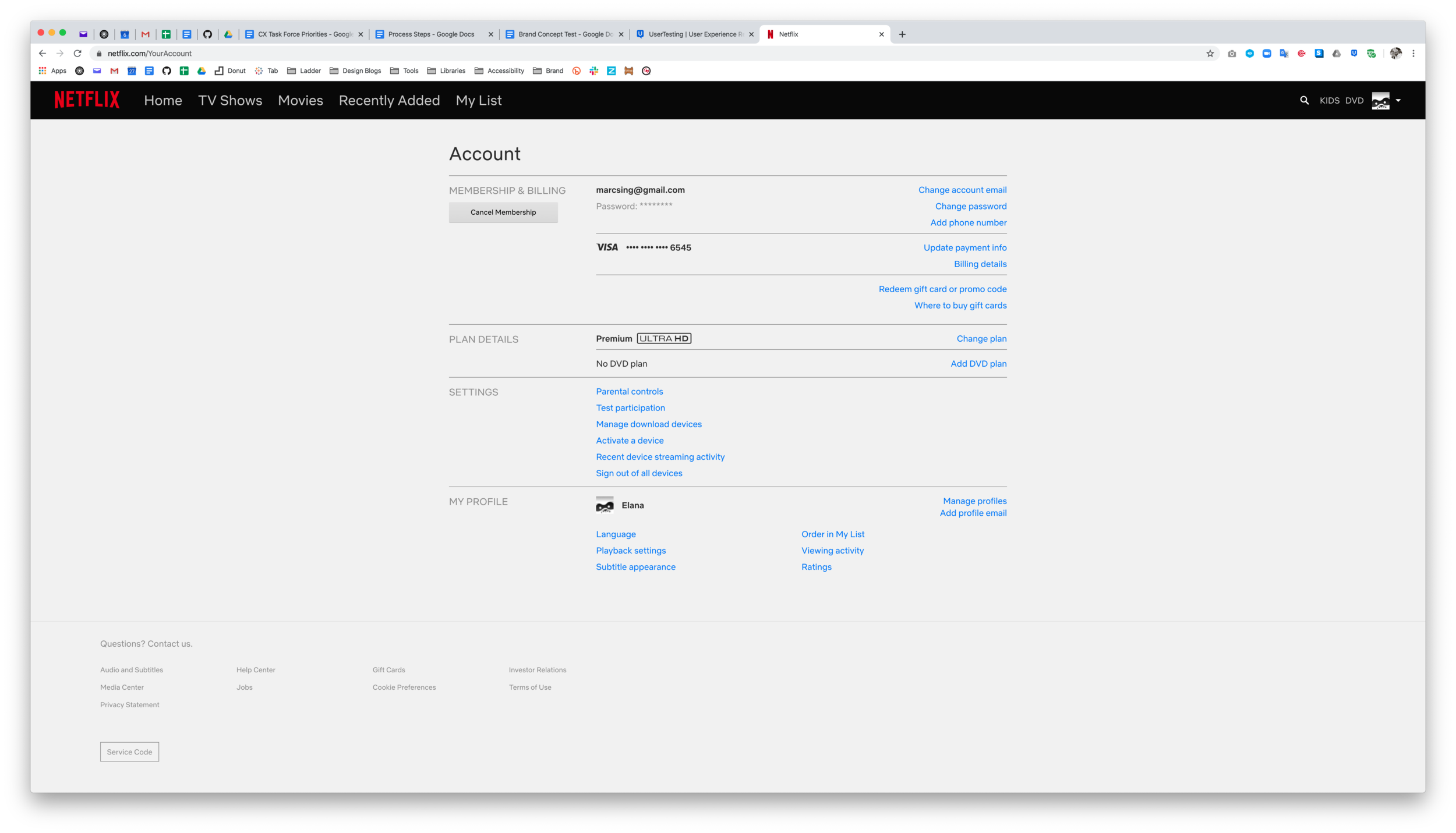
Once a user takes a policy, all other interactions take place on the account page. When a user drops off then returns, they land back on the account page. When a user is waiting to complete a lab, they manage their appointment through the account page. So much of a user’s relationship with Ladder occurs on the account page, yet it has received the least amount of design effort. The reality is that the account experience has organically evolved without a focus on where it should be headed.
Current Account Page
Current Policy Page
The Account Redesign MVP
The key to this account redesign was the organizational architecture, in other words, the navigation. Implementing a left navigation has a ton of benefits and will allow Ladder to thoughtfully grow as the company’s needs change and evolve. The benefits include:

Scalable
With infinite vertical space to add new pages and other elements, a left nav can dynamically adjust as needed.

Ease Of Use
Users have seen and know how to use a left nav. Once a user understands that it’s point and click, then they are on their way.

Glanceable
Having every task broken out by page lets the user know which options exist, so they can explore whatever they like.

Task Driven Pages
With each task being on its own page, there’s a greater likelihood that prompted tasks will be completed, due to a focused mental model.
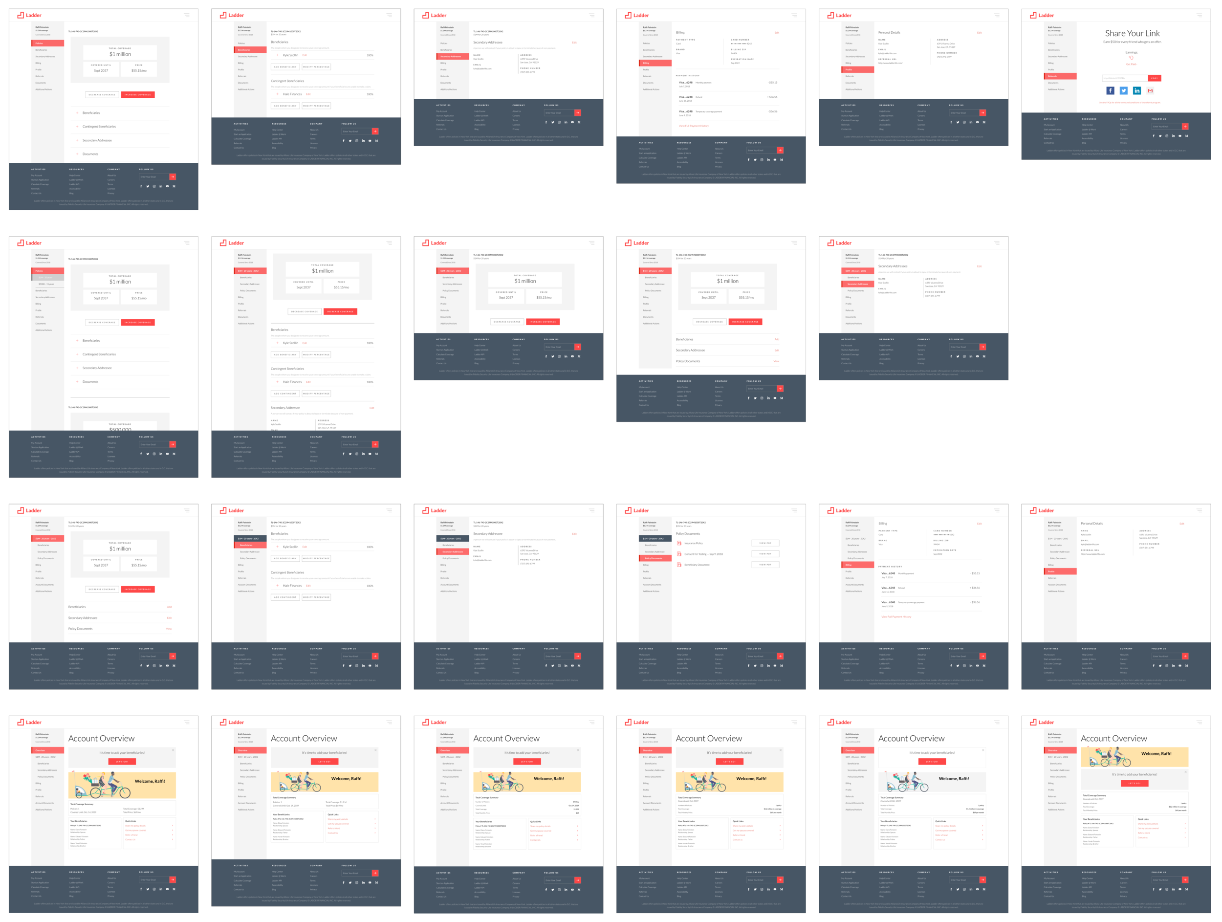
Account Overview
The overview page was developed as a way to provide the user with everything they want to see about their policy, while also providing engagement features to increase interaction and interest. This page takes the account experience from ‘policy details’ to becoming a possible lifestyle brand.
Cards
Cards were used to group relevant information, allowing us to both create digestible chunks of information while strategically organizing a variety of information on the same page. Currently, cards are only being used on the overview page, but as we move past MVP they will be implemented across the account experience.
Adaptive Design
In order to take this account experience to the next level, it had to work intuitively in a mobile setting. The left navigation lends itself to a standard hub-and-spoke pattern when on mobile, affording users a tap-and-go experience that keeps them task focused. While the overview page doesn’t work perfectly on mobile, the important functionality remains the same.
An MVP Implementation
With so much that could be done on the account experience, the project needed to be scoped so the concept could be proved out and progress could be shown. Other than the left navigation, the overview page, and some necessary tweaks, the rest of the pages would use the same code from the benchmark implementation and were separated out onto task focused pages.
This constraint was super important because it leaves space and time for our team to go project by project, enhancing the user experience from the ground up.
The real takeaway from this project for me is that by focusing on the user, I have laid the groundwork for an infinite number of enhancements that our policyholders will experience for up to 30 years at a time - and that’s awesome.
Process
Frame
The Ladder Site. There are three major user facing components to the Ladder life insurance experience.
The Sell. This is everything that a user may see prior to starting an application. These pages convince users that Ladder is reputable, and they provide information about life insurance and how it works. An important example of this is the homepage.
The Task. This is the application, which includes a minimum of 40 questions, a quote, a review page, and the offer experience. From a company perspective, this is the core of our business.
The Relationship. Once a user has accepted an offer and becomes a policyholder, they’ll be interacting with the site for up to 30 years. That’s a long time! The account experience needs to both engage and notify these users appropriately, supporting retention as the term matures.
Focusing On Acquisition. Ladder has spent the last two years focusing on acquiring new users and policyholders, which has moved the needle and created profitability. However, this has also allowed the account experience to grow organically as more and more functionality requests are made and built into it.
Heuristic Analysis. To better understand the current state of the account experience, I ran a heuristic evaluation. This would also help me understand which user problems need to be addressed as I worked through future concepts.
Navigation
There are major inconsistencies within the navigation of the account experience, including functionality within expander cards, access to the policy page(s), access to the referrals page, and use of button elements for different site interactions.
Architecture
Features are separated out at the account level and policy level, which is not obvious to the user, especially when they have multiple policies.
Furthermore, dynamic features, like lab results, are added as expander sections on one level or another without setting up the user’s expectation, which creates more confusion for the user.
Expanders
Though expanders make the page shorter while collapsed, they can take away from a task-based mentality.
From a technical perspective, expanders make it impossible to send a user to a specific account-based task because we don’t currently have functionality to do that.
Finally, expanders make the pages’ architectures more complicated, causing multiple layers of nested components, like the beneficiary’s details being two levels down, on the same page.
Mobile
The account design is not mobile friendly, constraining certain fields and components into what feels like an uncomfortable space.
Notifications
The notification system is subpar. It only uses prioritized banner alerts with paired emails.
The system doesn’t deal with multiple alert situations, isn’t guiding users where they need to go, and, due to the lack of anchoring, it can only land a user on the relevant page, not on the specified task.
Personalization
On the account page, there is a general lack of personalization to make it feel like “my account.”
As a consequence of the organic growth, there is little space for new and engaging features, and there is no obvious place to build them. The account page is hitting its usable limits.
In The Future. The project team held a small brainstorm session, mapping out all the things we may want to do in creating a new account experience. The endless list of ideas made it clear that scaling would be key in whatever solution we ended up with. The list included:
Greater User Engagement. Attempting to be more like a lifestyle brand, with user statistics, partnership connections and recommendations, and building a user’s financial portfolio.
Post Policy Function Expansion. This would include features to directly connect the customer support team with the user in a messaging platform, expanding the referral program, and asking for more user information to build out user profiles.
Dynamic States. Being more targeted with the user, providing the right information at the right times.
More User Tools. Creating more access to life insurance tools we have today and adding tools to shape a greater sense of ownership in our users’ mental models.
New Brand. While we want all of this to happen and more, the new account experience would also have to be easily re-skinned and re-designed in a new brand system that has yet to be determined, for the most part.


I needed to find a way to update the account experience to have more breathing room, allowing Ladder to scale with more focus on the policyholder experience and retention. Fundamentally, the account needed a new infrastructure.
Constrain
Navigation. Being able to make any of these changes and enhancements would stem from a navigational strategy. This would mean understanding the organization of information and how a user accesses each task on the account page.
Competitive Analysis. Now that I knew what wasn’t working with Ladder and where we wanted to go, I collected a set of sites that had notable account experiences, which acted as bright-spots and inspiration for what Ladder could become.
Check out the Competitive Analysis Deck


Comp Analysis Takeaways.
Side navigation is commonly used (most likely because its scalable, skin-able, dynamic, glanceable, and familiar), followed by a tab structure.
Information tends to be grouped by card or section.
Page titles provide consistent user feedback. Even sections and cards have titles for clearer scanning.
Nesting editable states underneath static states keeps organization more fluid.
With a well defined structure, there can be nested sections.
Sites use non primary panels to provide tips and tricks for better user experience.
Restricting the number of top level user actions keeps each page simpler.
Having a welcome message and/or identifying the user on the account provides an important level of personalization.
The small details, like an arrow to the selected area, makes a difference to the user.
The Final 4. From the set of examples shown in the competitive analysis, four sites stood out.
Etsy. The clean, vertical layout puts a spotlight on the user and allows for scale in the horizontal space. It’s intuitive and makes a lot of sense for users that need to show graphically heavy elements in the real estate below.
Stubhub. This left nav anchored account creates a task focused mindset, while also showing the user all their options. The user is guided onto a page with highlighted feedback, and information is grouped appropriately on each page.
Marriott. The mobile friendly layout keeps everything simple. Information is clustered appropriately, and the user can scroll through all their settings before making a decision as to where they need to go.
Southwest. This layout takes grouping up one level by using tabbed cards to organize top level decision making. Likely pulling from the mobile experience, southwest has its users scroll vertically and complete tasks all on the same page.
Concepting The Architecture. Taking large inspiration from these examples with bits and pieces from other sites, I put together wires to see how the Ladder components might work within each architecture.
The Etsy Approach
This concept uses a prominent top navigation. While intuitive and familiar, this design limits the number of pages. On the other hand, it keeps us from adding anything impulsively, making us more conscious of what we add in the future.
This layout has a bigger profile moment, but it requires a greater level of nesting tasks and details.
The Marriott Approach
This is a single page, mobile friendly concept, using sections to group various details and links.
The user can select a specific detail of a section, which takes them to that task.
This concept also pulls from Amazon and Netflix, keeping the first level of the navigation very ‘point-and-click.’
The Stubhub Approach
This concept uses a prominent left navigation. This makes it easy for scaling due to infinite vertical scroll, and it creates unique pages for each task.
This concept also takes pieces from Target and Carnival Cruise lines, including a personalization element at the top and quick links at the bottom.
The Southwest Approach
This concept is an evolution of the Marriott account page, providing a single page experience with grouped sections and subsections. The enhancement comes from showing individual tasks on the the same page using section cards.
This concept will have to use elements of the American Express inspiration due to its modular approach in order to add functionality within each subtask.
Explore
Stakeholder Meeting. With the navigation narrowed to the Etsy, Marriott, Stubhub, or Southwest approaches, I presented these options to the head of product, head of engineering, head of design, my product manager, and the lead engineer of the team. Everyone seemed to be on board and excited about this change, but no one had a clear vision as to what approach might be best for our future endeavors. As a result, they put the decision in my hands moving forward.
Stubhub All The Way. Though each approach lended itself to different pros and cons, the Stubhub approach did everything we were looking for. This included, but was not limited to:
Being familiar to users.
Having the best built-in scaling abilities due to its dynamic and vertical nature.
Lending itself to a number of notification system updates including badges.
Making a re-skin significantly easier because it’s essentially a list.
Account Overview. While the new approach was taking shape, I borrowed a concept from Imperfect Produce, which uses an account overview as the landing page. This could become a hub for notifications, statistics, referrals and engagement functionality, which I have wireframed below.
An iteration leading with an aesthetic welcome message, followed by the user’s coverage summary. The rest of the page consists of engagement pieces that go beyond anything we have today.
This iteration builds on the previous version by focusing more on a warmer welcome and visual statistics that drives the user down the page.
This iteration puts greater focus on a user’s account to-do list, which creates more intent to build out a fully functional profile, increasing interaction.
Focus
Stripping It Down. After a meeting with the project team, it was time to find the base functionality and an experience that we could use in an MVP build of the new account pages.
Reaching MVP. In order to get to an MVP, it would require taking the existing account components and breaking them down into individual pages.
The challenge would be determining how to connect linked functionality between separate pages.
Use Cases. With greater clarity around what would be part of the MVP, I got to work defining the various user states that impact the account experience. This was tricky because there were a lot of smaller, distinct states in between major user touch-points. Here are a few of the defined state flows:
Drop Off In App
Health Check Pending
Accepted Term Offer
Mobile Journey. With the desktop experience starting to take shape, I needed to dig into the mobile experience. Unfortunately, I thought the desktop design would be more responsive in the mobile space, but I quickly realized that the overview concept wouldn’t work the same way transitioning from desktop to mobile.
Define
Finally. All that iteration, exploration, and refining led to the final MVP mocks.
Desktop
Mobile
Bumps In The Road. Of course, a week into development, the engineer working on building the new account experience came back to me with a few states that I did not identify. For example, there is an empty billing state when users create an account through the referral program.
Check-in Success. With regular check-ins, an open line of communication, and a willingness to problem solve, the project is going live well before the site will be re-branded with a ton of room to grow into an amazing user experience.
Next Steps
So Much. There is so much planned for the account experience. We are starting from ground zero and building in endless directions. This is where the other half of my design job kicks in, which is making sure that we are building with purpose.
Here are some ideas we are currently working on:
A messaging center to more efficiently and safely have conversations with and transfer files from our customers.
An update to our referrals program, putting a spotlight on targeted users and expanding our outreach.
Having user preferences, so users can control their notifications from a central location over a 30 year relationship.
Showing personalized statistics to create a unique user experience and a reason to re-engage with their policies.
Connecting third party accounts to the Ladder website, which would create a platform of financial health.
Upgrade our alert system for greater user guidance and directionality.
And the list goes on … providing account guidance, building out user profiles, offering universal policy settings, syncing multiple policy payments, and more.
Learnings
Don’t Reinvent The Wheel. Competitive analysis was key throughout this project. It helped define the problems with the current experience, and it acted as inspiration for the new designs. Exploring multiple designs pathways allowed me to keep the big picture in mind, while working through our life insurance-specific implementation details.
Scaling On My Mind. Scaling is something I could not ignore from the beginning. This project took place amid an inevitable re-brand and a larger referrals program revamp, so it would need to work during these transitions as well as in the future. This constraint helped me make key decisions along the way and define a true MVP.
Focusing On Form. Instead of trying to create a new feature, this project focused on the information architecture and navigational experience. During this process, I was able to create greater flexibility as a platform for future growth. Then, by understanding the MVP experience, I could see what affordances the design offered me, like where the new notification system could live. Using this approach as part of my process, I hope to enhance my design skillset moving forward.

