
As the major pharmacy price aggregator for medications, GoodRx is rapidly expanding into the broader healthcare space. One area of focus has been integrating insurance as a way to provide greater transparency across pricing options in order to build trust with users. This piece will highlight the process utilized and rollout plan identified in order to add insurance into GoodRx’s price comparison for users researching their prescriptions, giving them a holistic view of all their payment options.
My Role
For this project, I worked with a PM counterpart and dedicated engineering team, along with the support of the core design vertical, to vision, test, explore, wireframe, iterate, prototype, and refine the insurance experience as the lead insurance designer.
Squad Mission
All pricing options should be presented equally.
As a business, we hope that the GoodRx price is the best price, but our team’s mission is first and foremost to present all options fairly, in order to save people money on their prescriptions and ease the healthcare journey.
Problem Space
GoodRx is being used as a research platform to find better pricing for individuals’ prescriptions, comparing GoodRx coupon prices against various pharmacy prices, which can vary widely based on pharmacy and location. Generally, GoodRx users can save a ton when using coupons vs paying out of pocket, at no cost to the user.
The problem is that there is a third player when comparing prescription costs, insurance. Insurance is not only left out of the GoodRx process, but requires the user to ask the pharmacist, at the counter, to enter in a different set of codes to compare all prices. This is a tedious, manual task for pharmacists, and it can be stressful for users, who are potentially holding up the line. Needless to say, this friction point causes substantial drop off when adopting GoodRx.
Therefore, users may not know what their best price is.

Moreover, insurance has been one of the most requested features, beyond price comparison, due to a number of healthcare data points that are difficult to aggregate and compare, including formulary coverage, deductible tracking, prior authorization and quantity limit warnings, and more. All of which may be a deciding factor for a user to use insurance or not.
“Adding your insurance information and creating the account is actually making me feel more confident that I'm actually going to get information that's accurate and more tailored to what I'm looking for”
Jon B.
My Hypothesis
The idea was to introduce a straightforward comparison of personalized payment options, i.e. the user’s selection for preferred pharmacy and insurance. This could ease the broader user experience by providing all relevant pricing information so users can determine their best price before arriving at the pharmacy.
Concept Based on this Hypothesis (Used in Qual Testing)
The Rollout Plan
In order to confirm the larger hypothesis, my PM and I defined a three phase rollout plan to test smaller aspects of the hypothesis in production, quantitatively learning and iterating towards a more clear, price-inclusive design for users to make their comparison without holding up the line at the pharmacy.
Rollout Plan
Overcoming The Hurdle. The phased approach provided the necessary data we needed to convince our stakeholders to continue expanding the insurance offering, as well as kept us aligned with user behaviors and the existing conversion metrics. Moreover, by leaning into a sequential rollout, we could take any learnings from one phase and apply them to the designs of the next phase.
Below you will find the concepts I designed for each phase in order to determine and plan for what we wanted to test, as well as how many phases there might be, and how we might end up with the concept proven during the qualitative research (identified as phase 3).
Three Concept Phases
The goal. In each phase, I worked to reduce cognitive load and streamline the comparison within the scope of this project.
Phase 1, test what we know works from our MVP, adding an insurance section onto the price comparison page.
Phase 2, define a more consistent content architecture to test connecting insurance to the preferred pharmacy.
Phase 3, target research-focused users by stripping out unnecessary content to test overall impact to claims and various page-element engagement.
Process
Frame
MVP Optimized Design
The MVP on the Archived Page. Initially, I wanted to add the insurance price to the user’s comparison process, when searching for a prescription. So on the price comparison page, I designed and worked with my cross-discipline team to implement an insurance section that sat between the user’s selected preferred pharmacy and all the other listed pharmacy rows. This way, users who were researching prices across various pharmacies would see the opportunity to compare their insurance and engage with it as another data point, for complete price transparency, in their decision making process.
Click Through Rate Supporting Primary User Task

No Noticeable Impact To The Core Funnel

Expanding the Insurance Touchpoint. The optimized version of the MVP tested significantly well, attracting a large number of Medicare users, making it the second most selected call to action (CTA) on the page (shown above). Getting this feedback and knowing that we wanted to make a more direct comparison between an insurance price at a specific pharmacy and a pharmacy-specific GoodRx price, we expanded the insurance touchpoint to the pharmacy specific pages, with an updated design to match the updated branding on these pages (shown below).
Coupon Design Expansion
Clean Slate. While the coupon page had already transitioned to the new tech stack and new design library, the price comparison page was using the older branding on the old tech stack. Therefore, when the new price page was rolled out into production, the insurance integration MVP was removed from the experience, along with several other features, which leads us into the opportunity.
— The Opportunity —
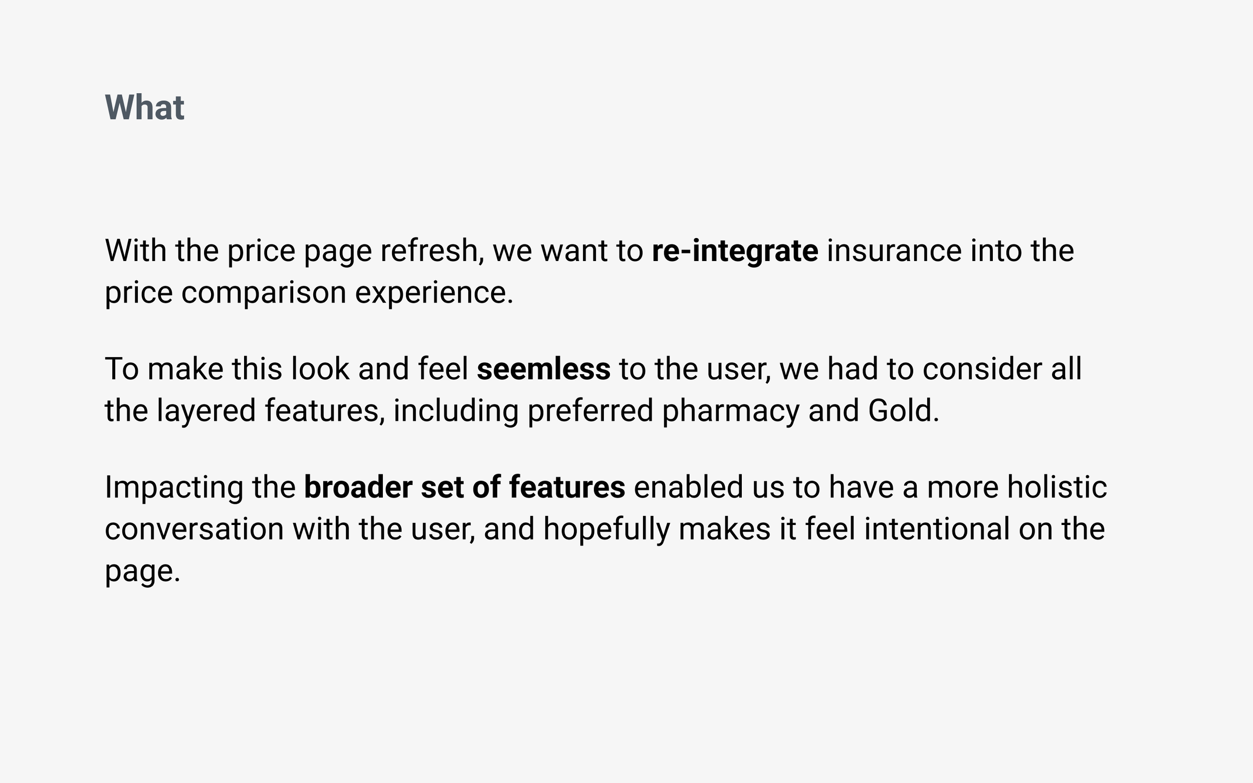
As part of an ongoing initiative at GoodRx, the price comparison page, which displays aggregated pharmacy prices for a given prescription, was redesigned, removing several functionalities, including insurance. This provided an opportunity to rethink how we could integrate insurance in a more intuitive and conversational way, meeting the prescription-researching mental model vs just adding a section onto the page.
“It would save you time, embarrassment when you’re at the counter and asking the pharmacist to check prices for you.”
Kristina
Constrain
The Ideal Flow. During design discovery and exploration for the core prescription search funnel, I identified a flow that I considered “ideal,” which designating how we could integrate insurance into the current GoodRx process more holistically. I wanted to use it as a short term vision, as we implemented and learned from the various smaller projects, in order to iterate and optimize, shaping the insurance product with direction.
Ideal Flow
Existing Guardrails. Though, one of the major constraints for the insurance reintegration project became working inside the existing Preferred Pharmacy-to-Price Page experience, which looked like this:
Coupon-First Preferred Pharmacy Flow
Onboarding Flow. Therefore, I prioritized more of an onboarding-like experience, providing the user with relevant, task-focused options in order to get them where they want to go, while providing a more personalized prescription comparison.
Onboarding Flow To Stay Inside The Constraints
Moving Forward. This project focuses on how I integrated insurance onto the existing price comparison page, evolving the page design and conversation with the user to better reflect their price-comparing mental model, which then also lays the groundwork for the broader onboarding flow and vision changes.
Explore
Luminosity. Ideas conceptualized during exploration were mocked in black and white to keep the ideas more conversational as they were shared with team members, designers, and stakeholders.
Opportunity Explorations
Going Wide. I got to work looking at each area of opportunity on the price page, taking into consideration the various user states, and how we might transform different elements on the page to define the right conversation with the user.
Grouped Pharmacy Prices Explorations
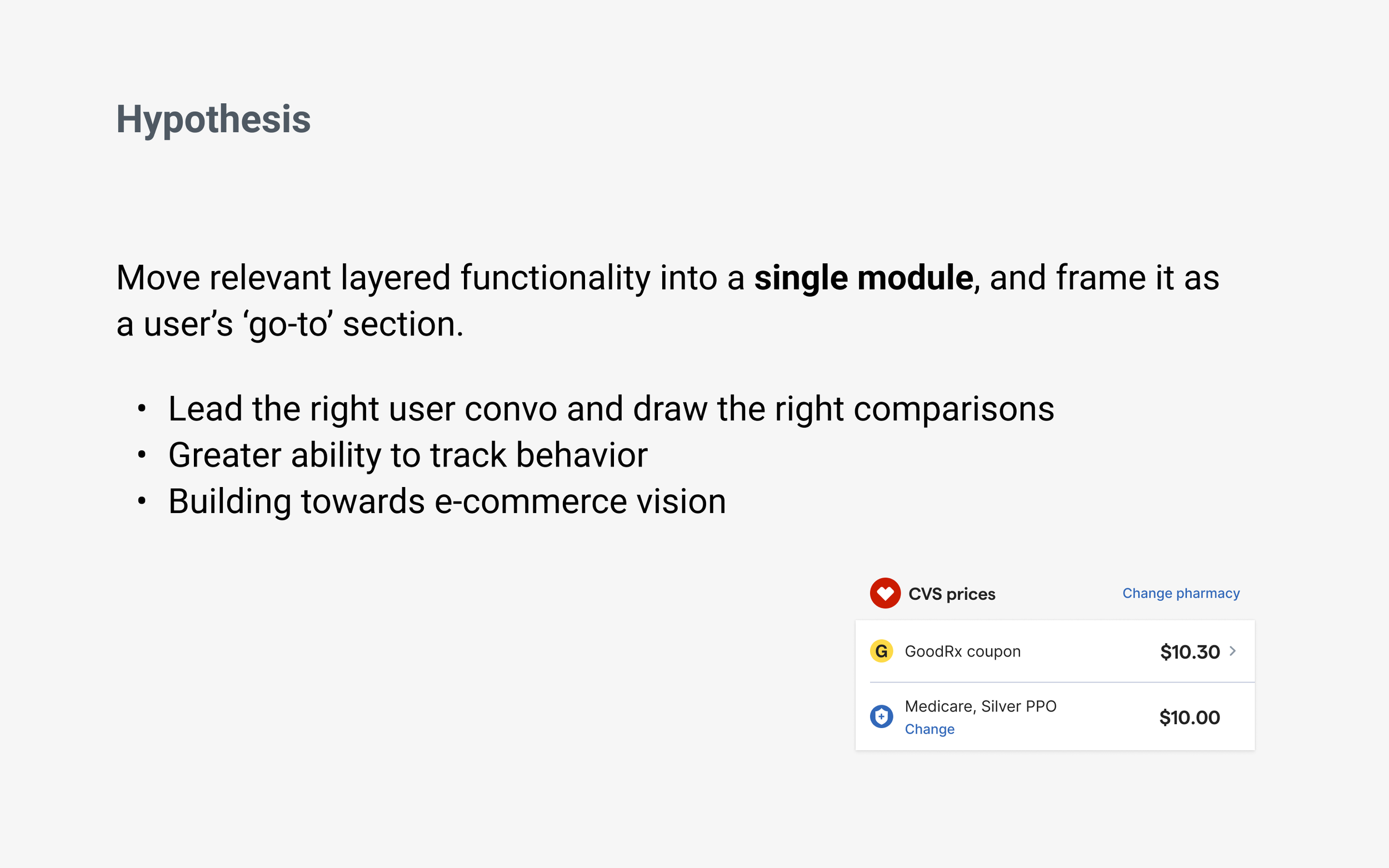
Going Deep. Based on a number of discussions with my team and design leadership addressing the right conversation GoodRx should be having with users, I quickly narrowed to a concept utilizing a more condensed approach, based on the user-selected pharmacy, for a more personalized touchpoint. This created a closer connection between the preferred pharmacy and insurance features, which made sense since insurance is really pharmacy specific.
Prep Slides For Stakeholders
Grouped Pharmacy Concept Shared With Stakeholders
Narrowed Concept. I shared and evangelized this concept with a number of stakeholders, as well as other teams that wanted or needed visibility, and asked them to provide feedback that we can take into testing. Some identified beneficial opportunities, like the enhancements we could make to bring in our Gold subscription program pricing, and others expressed concern based on the potential level of impact this could have on our claims conversion, defined by the existing design experience, known as "coupon-first”. All of which were great considerations that I took into testing, in order to better analyze how people understand the price comparison.
Focus
Gut Check Study. After iterating through many explorations and getting design feedback, I conducted an unmoderated qualitative study analyzing three insurance integration explorations on the new price page. The study objective was to learn how users engage with and understand insurance in the context of price comparison.
High level questions I was looking to answer included:
Do users naturally engage with the insurance entry point?
Do users understand the connection between preferred pharmacy and insurance?
Do users understand the difference between their preferred pharmacy price, insurance price, and gold price?
Do users understand how to use the prices on the page?
Study Approach and Setup. In the study I screened for participants who had Private insurance or Medicare, had ongoing prescription medications needs, and purchased medications every 1-3 months within the last 6 months. The study was conducted in User Zoom with three separate tests of 5 participants, totaling 15 participants.
Link to Study Script
Analysis Themes. While analyzing participant behavior and comments when they were engaging with the prototypes, it became apparent that their comments fell into four categories:
Discoverability: Participants acknowledged both elements in the pharmacy section, as well as other relevant information on the page.
Connectivity: Participants called out the direct comparison between the preferred pharmacy and insurance prices listed in the new section, as well as the comparison between the CVS pharmacy and other pharmacy rows below.
Clarity: Participants understood what the goal of the page was and how to utilize the provided information to make a decision as to what price they would go with.
Opportunity: Participants discussed relevant recommendations as to how we could improve or add to the concept, showing a level of usefulness and understanding.
The Benchmark
Link to Prototype
What. Adding an insurance section above the other pharmacies. No change to coupon-first preferred pharmacy experience.
Finding. Participants primarily focused on the prices at the top, drug details, and coupon prices, comparing everything else below it considerably less. Participants were even confused by the number of elements to review, as well as the hierarchy.
“To tell you the truth, I didn't see the insurance part there, not until I researched everything and clicked for hotspots.”
Your Prices Section
Link to Prototype
What. Attaching insurance to preferred pharmacy selection, and using visual design to show preferred pharmacy and insurance as price rows.
Finding. Participants more clearly understood the price options but still showed a disconnect between the insurance price and selected pharmacy. Though, there was more and faster discovery of elements on the page.
“I would give it a four. It was fairly clear, not a five because it wasn't a piece of cake.”
Pharmacy Price Section
Link to Prototype
What. Attaching insurance to preferred pharmacy selection, but modifying the content hierarchy defining a pharmacy section and its subsequent prices.
Finding. While identifying some needing context tweaks, participants were more able to compare their pharmacy price to their insurance. Participants were also able to use the module label as a pharmacy and then relate it to the pharmacies below.
“So it's telling me the CVS price using a GoodRx coupon and comparing it directly with the Medicare silver PPO plan. That's my understanding of what CVS prices section means”
Emerging Concept. Based on the four key analysis themes, the Pharmacy Price Section concept seemed to provide the greatest amount of understanding, proving to be the qualitative front runner. Therefore, I decided to continue to iterate in that direction, with the support of the team.
New Pharmacy-Insurance Module Concept From The Qualitative Study
Perspectives Blocking Learnings. Unfortunately, we weren’t just getting the support we needed to run this test in production. There were too many loud voices disagreeing with this approach that completely changed the newly successful and existing concept, the coupon-first design, which highlighted the preferred pharmacy selection.
Moving Forward. TL;DR my team and I decided to create a rollout plan for incremental learnings as we move towards the concept that came out of the qual study I ran.
—
Basically, integrating insurance into GoodRx may prove oppositional to our traditional revenue-focused goals by negatively impacting claims. Though, it may also have a positive impact by providing a new trust factor to our users. We just don’t know yet.
Therefore, my PM and I planned to implement more iteratively and intentionally, as we pursued our mission, the user needs, and the concept that emerged from the qualitative study, above. This way, we can focus on testing smaller hypotheses and track overall success with less noise, especially when it comes to making sure we aren’t significantly hurting the claims conversion rate, created by the coupon-first concept.
Define
Rollout plan
MVP Flow Used Throughout Prod Test
Rollout Strategic Plan
Rollout Reasons. While the main reason for implementing into production with a rollout plan is to watch for impacts to claim conversion, there are several advantages that I planned on using to our benefit. These included testing more targeted changes instead of all at once, using the data insights from one phase to help shape the next, and avoiding quick failure and project termination that could be caused by a large decrease in core metrics.
Summing it up, our goal was to move fast, learn faster, and stay flexible by adapting the concept as we progressed, like a startup might do. Below, I review each of the phase concepts that were initially planned.
Link to Rollout Deck
Phase 1 - Detached i.e. The Benchmark
What is it? In the initial phase, I planned on testing the benchmark, which is about getting insurance back onto the price page by adding an additional insurance-specific section, in the same location it was placed on the archived version of the price page. This doesn’t change any other part of the page design and acts as another price point to compare.
What we want to learn?
Does the data from the previous price page’s insurance implementation holds true for the new page?
How will insurance impact the engagement of other elements on the page?
Phase 1 Delta. Control and variant are not so different in this phase. The only real difference is the addition of the insurance section. It’s a starting point, so the insurance team can test into the next phases, knowing we have a fallback if the qualitative insights don’t convert to quantitative outputs.
Phase 2 - Connecting Insurance
What is it? Without removing any of the content from the coupon-first experience (shown in the benchmark version in phase 1), this concept reframes the pharmacy coupon and insurance touchpoints into a single section. By utilizing the visual identity from the rest of the page, the new design creates a more consistent look and feel, while bringing the two related features closer together into a more personalized section.
What we want to learn?
Will users change their behave with a new look and feel, which connects insurance to the preferred pharmacy?
Will engagement with the insurance feature increase?
Phase 3 - Simplified Comparison
Phase 3 Variations. I actually landed on several variations of the third phase due to not having enough data to choose one over the other. While, all of which could conceptually accomplish the same quantitative test, they would definitely impact the page conversion differently, which is why it is important to have more information before going with one.
What is it? This strips the conversation down to bear essentials in a single section, while providing a direct comparison between insurance and preferred pharmacy.
Iteration 1
Showing just the price rows
Iteration 2
Highlighting preferred pharmacy with a sharing action
Iteration 3
Highlighting preferred pharmacy with the ability to go to the pharmacy’s coupon page
What we want to learn?
How do claims change without the prescription codes on the page?
How are users interacting with other components on the page, compared to the benchmark?
Front Runner. Knowing that the business is currently using the ‘sharing action,’ we will most likely start there. Although, if I had to make a bet as to what design would have the best overall conversion, I’d say iteration 3. Why? Because it accomplishes the same core function that having the prescription codes on the page does, and by providing a primary call to action (button) the user now knows what we want them to do, versus comparing all the other buttons that look the same. And, as icing on the cake, it makes the user action more trackable as well, since the user has an action to take.
Visual Tweaks. You’ll notice throughout the iterations I have either pushed the prices to the right and labels to the left to mirror the pharmacy rows below OR left aligned prices to provide purposeful contrast on the page and allow for vertical space to add insurance alerts and secondary information. Again, there wasn’t enough data to determine a better design, yet, therefore, it’s probably something to test into.
In Conclusion. While the phase 3 design may change by the time we implement it, I want to get to some version of it in order to prove or disprove the larger hypothesis, that a more personalized section will play more naturally into the user’s comparison mental model and increase both conversion and engagement.
In doing so, the design will drive the team’s mission to create greater price transparency between all three price options, retail, GoodRx, and insurance in order to ease the prescription purchasing process well before the user ever goes to or orders from the pharmacy.
Next Steps
Engineering Consideration. On one hand, the rollout plan creates more work for our engineers as they will have to continuously rebuild and configure the same module several times over throughout the testing process.
On the other hand, the rollout allows us to setup the whole structure once, and then build on it moving forward, making each phase smaller in scope.
As long as my engineering counterparts are bought into the idea and understand why we are testing this way, I know we will be successful in building a scalable feature that users engage with, going beyond their expectations.
Getting To Next Steps. While users expect insurance as part of the prescription purchasing process, integrating insurance transparency into the GoodRx product has proved anything but expected, and provided many delivery challenges. Once my team and I have overcome this re-integration, we will be able to execute on so many other helpful enhancements and insurance experiences that we have envisioned and designed out throughout the design and development process.
Some of which include:
Plan Level Insurance
Exact pricing for Medicare and, eventually, private insurance
Preferences Flow
Setting insurance as an onboarding step to the price page
Optical Character Recognition i.e. “OCR”
New technology that can scan and read your insurance card for insurance information and prescription codes
Learnings
Check Your Fear at the Door. Innovation leaves no time or space for fear. That’s why we have process, exploration, collaboration, critique, qualitative and quantitative testing, and the ability to ramp up and down, or even rollback. Yes, it’s hard to change something that works, especially if it’s new and potentially oppositional, but in order to take big leaps forward we may need to alter what we think we know, probably taking a step backwards, to learn what is possible.
Conflicting Objectives. The fastest way to be slowed down is when there isn’t cross team alignment on what a team’s/vertical’s/company’s primary goals are, so everyone ends up making up their own vision, working towards it, and there is no way of reconciling them. We are all just stepping on each others’ toes, drifting further apart.
Design is Not Appeasement. As a designer you definitely want to share early and often, it creates trust, context, and buy in. But, you also want to stay away from design by committee. It’s easy to forget sometimes, especially in certain organizational structures, and it can create a ping ponged effect, that makes the design process stagnant and frustrating. So remember that you are the expert and are allowed to take ideas, thoughts, and comments into consideration, only applying what makes your design better for the right reasons.

